
Noir in Hong Kong (Beta build.)
How I tackle UI and Playability
As someone who spends far too much time playing community-made visual novels, I’ve realised that I have a lazy shorthand to whether or not the UI scratches my snobbish itch:
“Do choices just instantly disappear after you select them?”
If they do, I wish they didn’t. Choice buttons, I feel, should linger on the screen just like decisions should linger in the player’s mind. Weight of choice and consequence should be implied visually. For choices to disappear instantly tells me that a game designer has relied on Renpy’s standard template. There’s nothing damning about that per se but it certainly suggests that there’s an unexplored design space.
I’m going to suggest some of the ways I deal with these issues. I know some sound very difficult but I can't live without them.
Making choices linger
Often when working in RenPy, you’ll hear the voice in your head say “It couldn’t be that!” when you consider a convoluted solution to a problem. A lot of the time, I’ve found that the only way to get the results you’re after is to take the bull by the horns and do some very inelegant things.
To make choices linger, what you need to do is create a completely different screen that takes the place of the first one. It’s important to understand that in RenPy you’re able to make frame-perfect switches between one image/screen to a duplicated version so quickly that the player doesn’t even see a flicker.
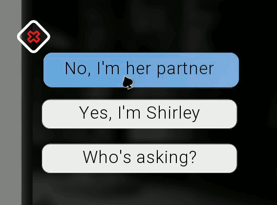
So really, a “lingering choice” means:
- Show screen Choice
- (Player selects choice button)
- (screen Choice instantly vanishes, as in RenPy’s default)
- Show screen ChoiceNull (A duplicated version on the Choice screen with zero interactivity and new ATLs.)
Then, you should think of how you want your animations to suggest 'affirmation' vs 'rejection'. I stole the visual language from Ingthings's wonderful Of Sense and Soul, in which selected answers ascend and rejected answers drop and fade away.
No uniform buttons!
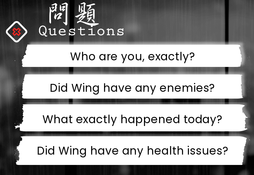
Ok, see these buttons. Can you IMAGINE how terrible it would look if they all had the same torn edges? Now, of course, this is only something that matters given the fact that my game has this particular style choice (Torn paper is chaotic.)
But how do you do it?
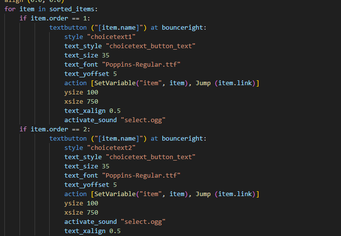
Well, in this case, all of my questions are actually items in an inventory, so when the question screen comes up, it's displaying a different style of button depending on the ID number of the question/item. In order to delve any deeper. The same thing could be done on a non-inventory based screen, just manually chosing different styles for each.
The glimmer
Dear friend - This is where I will lose you. For good reason. This is something I discovered quite recently and it felt absolutely insane to me from beginning to end. However, I decided to follow through on the idea for nearly every clickable item in the game.
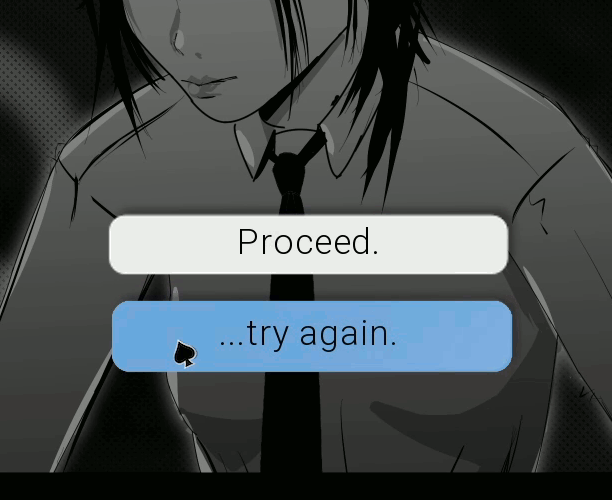
The insane part is that this was done in Blender. I enter the image of the button as a plane, decide its physical properties and then animate a light moving past it.
But let me explain why I think it's so vital: Doing things in this way forced me to ask myself questions about the 'physical properties' of the buttons the plater interacts with. It also gives the impression that these things aren't just abstract shapes; They react to the player's touch, exist in a limited 3D space and are made.... of something. They become just a little bit more tactile and I think it adds a tiny spike of dopamine to see them.
The 'Glimmer', I should mention, requires another layer of coding that could induce migraines. Bascially, (sigh), it means that every single button on every single screen has a blank duplicate over itself in the exact location, that only triggers the glimmer animation when hovered. (Look, if anyone honestly cares for a more detailed breakdown of how that works, please DM me.)
Comments
Log in with itch.io to leave a comment.
You know, I've never actually considered your idea of keeping choices up after selecting them to emphasise them, but now that you mention it...yeah, that's actually a really good idea. (Though I'll definitely be going with option #1 of the suggestions you've made - the others sound a bit intimidating for me!)
To be clear though, I think everything I say above would be inappropriate in tech-themed games like Artificial Nexus (Or Coffeedrip Studio's Esper X Guide.) where the whole theme is that you're battling against an indifferent computer system. In those cases, it's thematically consistent that the player's entries are somewhat colder.
I'm also aware of examples in Noir where a serious decision 'pops up' in a way that feels inappropriately cheerful!!! Argh!
I suppose that all I mean by the post is that this whole area of screens entering/ leaving in RenPy is a design space that I really appreciate seeing people play with (Although I admit I might be crazy.)